Creative Design and Photography with a Purpose

Posts by riaona


Global Commitment Initiative

Ria Custodio
rcustodio@csusm.edu
http://www.csusm.edu/chabss/gci

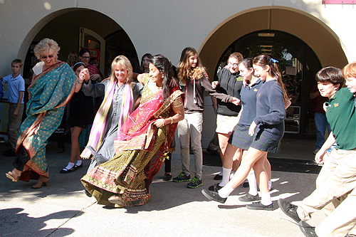
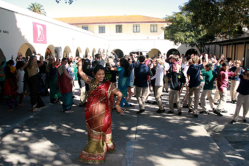
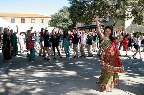
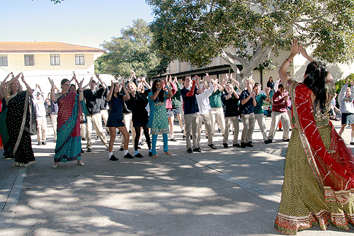
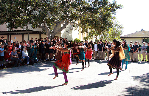
Community Service and Volunteer Fair 2016

San Marcos, USU Ballroom
1
March
2016
Elizabeth Matthew
ematthew@csusm.edu


The CHABSS Global Commitment Initiative engages students in activities to broaden their understanding of global issues. The GCI Community Service Fair is an opportunity to put that global knowledge into action locally. Learn about volunteer opportunities that allow you to serve your local community while earning valuable experience and preparing for future careers.


Purgatorio Film Screening

San Marcos, USU Ballroom
29
March
2016
Elizabeth Matthew
ematthew@csusm.edu

Presented by The College of Humanities, Arts, Behavioral and Social Sciences and the Global Commitment Initiative with support from Co-Curricular Funding Awards, Film Studies, Latin@ Center, and Border Angels de CSUSM

Film description: At times harrowing, at times hauntingly beautiful, “Purgatorio” exposes the politics of and around the US-Mexico border not so much by explicitly addressing the technical intricacies of migration regimes, but by capturing experiences in the border region on a human scale. In its display of the widespread exposure to different forms of violence on both sides of the border, the film also succeeds in depicting the peculiar interplay between the presence and the absence of government authorities that structures ‘la frontera’. This film should be of interest to everyone in the social sciences and the humanities who teaches in migration and border studies.


Leave a comment

custodio-FinalProject

This GIT 230 Final Exam, Part II project pays homage to “Hey Girl” memes written for Ryan Gosling. A strong image of Ryan Gosling was necessary to make this movie poster a reality. The image was opened in Photoshop and the size increased to fit the dimensions of a poster.

I wanted to give the image an ethereal, old-world feel so I changed the mode to grayscale in Photoshop. The brightness, curves, levels and exposure were adjusted to give the image lightness. A diffused glow smart filter was selected to add a grainy look and more flair. Once the image of Ryan Gosling was prepped and finalized in Photoshop it was placed on the first layer of a poster-sized file in Adobe Illustrator (AI).

Four layers were created (image, title, taglines and info) in AI to separate each design. The title, “Hey Girl” was added near the bottom of the image using Century Schoolbook font and outlined. Once outlined, a white and 75 percent black gradient, a 1 pt white stroke added, a drop shadow, and the diffused glow smart filter were added to give the title more dimensions. A similar style was created to the tagline “From the Director of the Notebook.” Only an outline and the diffused glow smart filter were added to the tagline, “I don’t think it’s really about me” and the date. The date was centered at the bottom and was scaled to increase the size and to give it prominence.

A paragraph block with the movie information was centered beneath the image and taglines. An Ariel Narrow font in all caps was used for the movie poster information. Differing font points were used to give the names a bolder look against the titles.

To finish the movie poster, the parental guidance and Dolby digital logos were prepped in Photoshop and placed at the bottom of the movie poster in AI. The movie poster artwork was locked and saved.

Leave a comment

custodio-surf-board

This surfboard concept was designed for all divas who love beach life. I searched online and found surfboard artwork that had the right balance, saved it, and placed in Adobe Illustrator (AI). The image was traced using sketch and expanded. The sketch was cleaned so that only the outlines of the surfboard remained.

Once the surfboard was outlined and expanded, elements of design were created. Circles were copied and rotated to create a round logo style. Two ocean colors were added to the swatch panel and the live paint bucket tool used to fill in the circles in a cohesive pattern. Both overlay and transparency were used. Once the circles took shape and were colored, they were grouped. The grouped circles were copied and the scale tool used to create a uniform look on the front and back.

On the back of the surfboard the pen tool was used to create three lines that were filled with the same two-colored swatches used throughout the design. Bickham Script font was selected and a type on a path tool used to give the “Bonita Surfboard” name a feminine, flowing approach. The text was outlined then a gradient using the two colors chosen. Half of the outline of the back of the surfboard was traced and shading added to give it dimensionality.

The front of the surfboard used the same elements copied from the back only reflected. Two wavy designs were created using the pen tools and each filled with both design colors.

Leave a comment

CustodioMagazineCover

I created a magazine cover based on a love for music. I started playing around with the title and thought it appropriate to name the magazine Burning Music since there is an issue with copyrighted music and consumers burning it for free. Once the title was developed, I decided to find images of a guitar on fire and a band that is know for it revolutionary beliefs and political views then I began prepping in Adobe Illustrator (AI).

The photo of a guitar on fire was opened in AI. I selected the image and created a live trace using 16 colors then expanded it. Next an image trace using high fidelity photo of bass guitarist Tim Commerford was expanded. I placed a white rectangle behind the photo to create a photo border effect, grouped the image and white rectangle and then added a drop shadow.

A new file in AI was opened for the magazine cover, bleeds were added, and a white and black gradient used for the background. The photo of the guitar on fire was the prominent photo and needed stress so I placed it to the left side of the cover. Commerford’s prepped photo was place above and to the right of the guitar on fire. The title Burning Music was added, and an outline and a gradient were created using the colors of the flames. More text was added to balance the cover.

Lastly, a logo was made in AI following the shape of a guitar and the letters “B” and “M” using the pen tools, anchors, lines, shapes and gradients.

CustodioDartboard

Leave a comment